Colour harmony in floristry - the Flowercard guide
Want flowers that POP with colour? Here’s our simple guide to getting it right.
Why is colour important in floral design?
Ever wondered why some colours go together beautifully while others don’t? Personal preference plays a part, but there’s some science behind it too…
‘Colour’ is one of the five key principles of design, and is largely considered the most important. If you’ve ever arranged flowers in a vase, you’ll know when your chosen combination looks fantastic - and equally, when something just doesn’t sit quite right.
As any trainee florist will know, there’s a lot to learn about the different principles and elements of floral design!
And what better way to start than to use examples from the expert florists here at Flowercard? We’ve covered some of the most popular colour harmonies below to get your creativity flowing!
What is the colour wheel, anyway?
The colour wheel brings together primary, secondary and tertiary colours in a wheel - there are lots of imaginative ways of showing this, such as the one below. (You may even have mixed one yourself during art class as a kid.)
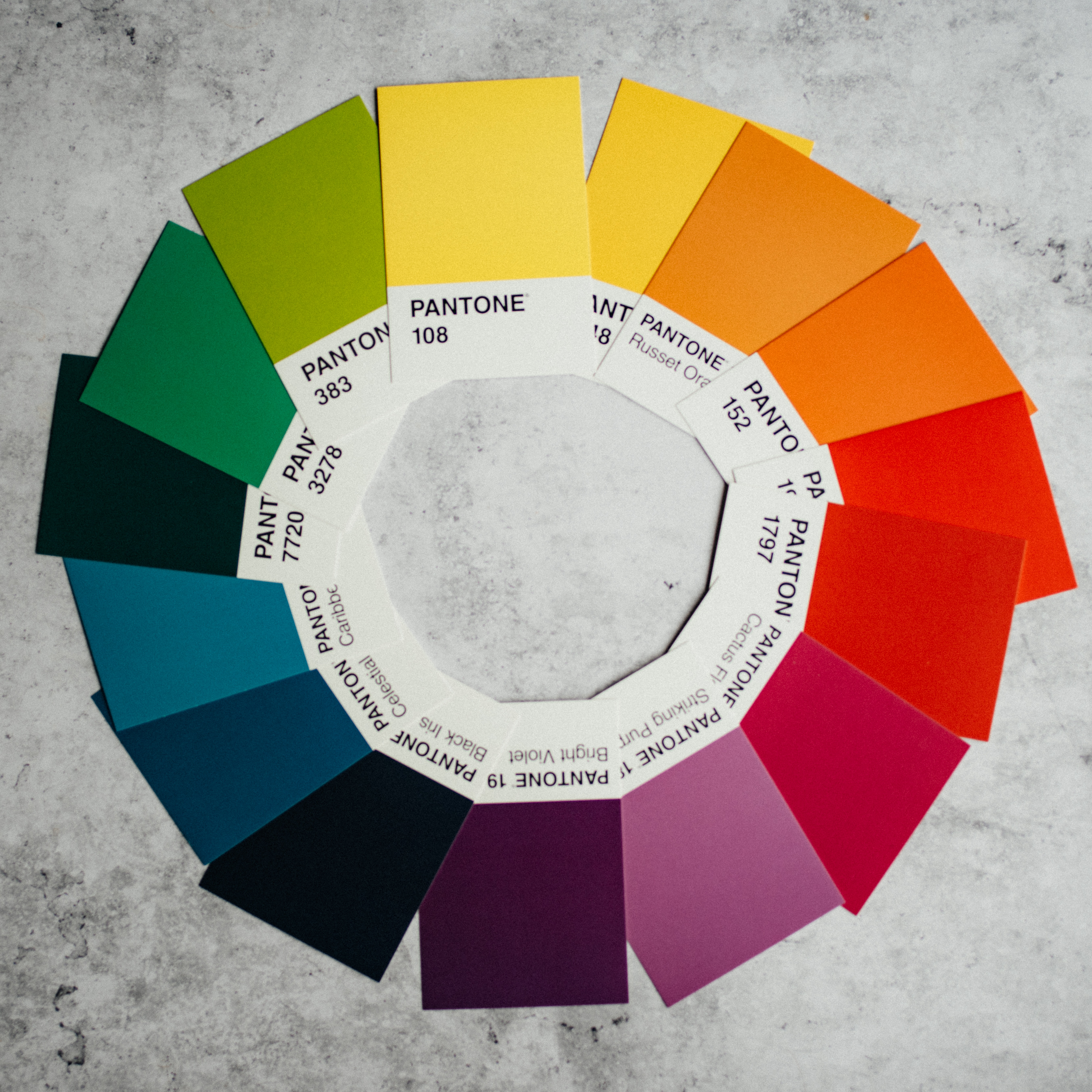
The ‘rules’ that govern which colours go together (colour harmony) are the same for florists as they are for fashion designers, graphic artists, interior designers - in fact anyone who cares about colour!
What is a good colour harmony?
There is no ‘right’ or ‘wrong’ colour harmony to choose when creating a floral design. However, selecting a colour harmony that you like, and focusing your flowers around it, is a simple way to create something that looks good.
Think of the below as a series of pointers to help you create pleasing colour combinations.
To get us off to a great start, we’re going to show you some examples of the different colour harmonies that we use in our own arrangements.
Monochromatic colour harmony in floristry
A monochromatic colour harmony is all the shades, tones and tints of a single base colour (or hue). This creates a cohesive, harmonious look. As florists, it allows us to simplify our design by not having to worry about which different colours go together.
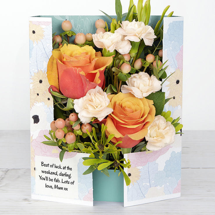
Peach Satin is a lovely example of how using tints and tones of orange creates depth and interest.
Complementary colour harmony in floristry
- Opposites attract - red and green is a classic combination
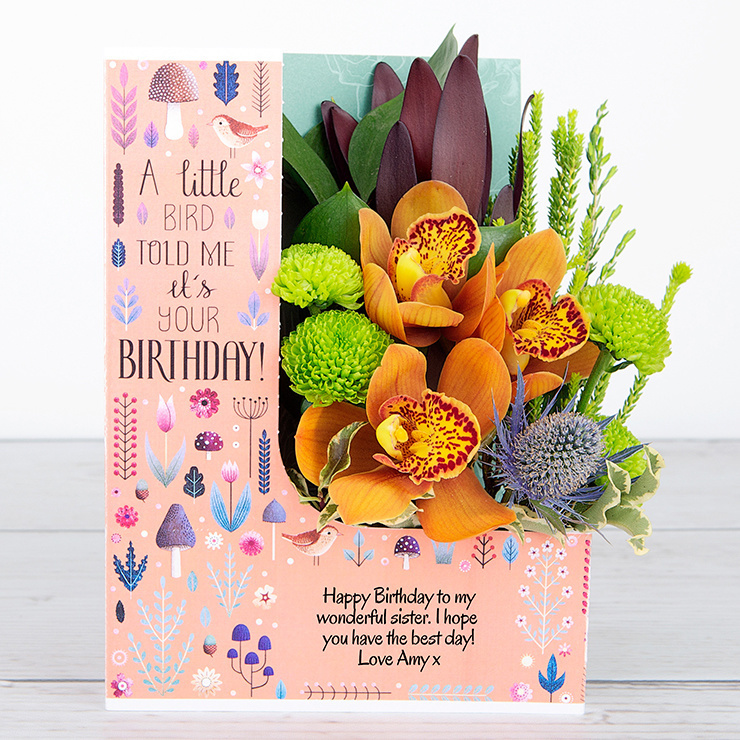
A complementary colour scheme combines colours from opposite sides of the colour wheel. This has the advantage of creating a real colour ‘pop’ - which is ideal when you want to create real focal elements, such as bright red roses against a green backdrop. Other complementary colour combinations include orange/blue, red/green, and yellow/purple. This Woodland Magic Flowercard shows this through an orange orchid - a lovely complement to the rich blue eryngium (often known as sea holly).
Split complementary colour harmony in floristry
Complementary, but with extra depth - try red + yellow/green
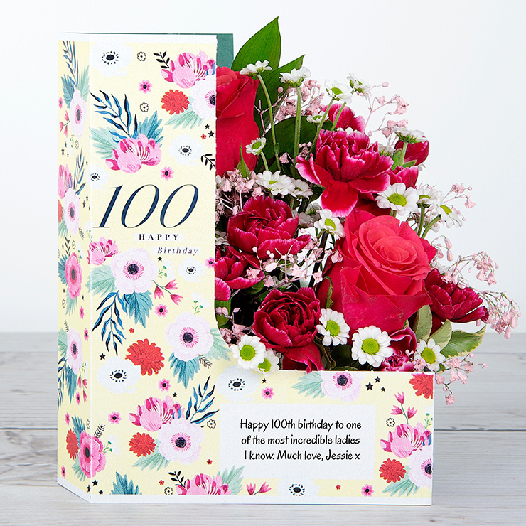
A split complementary colour harmony is created when a single hue is used alongside two analogous colours to its complement. That’s a fancy way of saying a basic red used with blue/green or red + yellow/green, for example. These schemes are a way of adding depth in an arrangement. Our 100 Birthday Hugs arrangement is a floral example of split complementary. The red/pink of the roses are a great complement to the green pittosporum and lime green ruscus leaves. A really bright and beautiful statement, which is fitting for someone who has reached this incredible milestone.
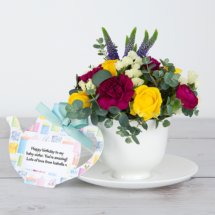
Tetradic colour harmony in floristry
Four colours evenly spaced
A tetradic colour harmony is created when you combine four colours evenly spaced around the colour wheel. For example, green + yellow orange + blue violet + red. It’s a good way to use lots of colours within a design and playing with different hues, tints and shades allow one colour to really shine with the others as accents. Birthday Ruffles is a close to perfect tetradic colour harmony, with yellow, blue/violet, red/pink flowers and green foliage to pull it all together. Bold, beautiful and the perfect gift!
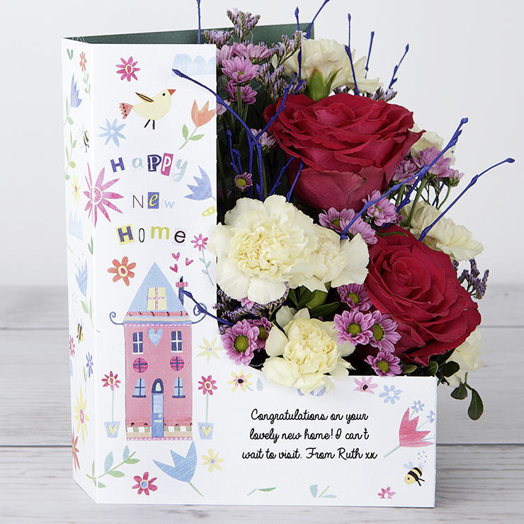
Triadic colour harmony in floristry
Three colours evenly spaced - think Rubik’s Cube…
A triadic colour harmony is created when you combine three colours evenly spaced on the colour wheel, for example, red/blue/yellow and orange/purple/green. There is a strong contrast between these bold colours so it works well in toys, such as in the Rubik’s Cube.
Happy New Home brings together red flowers, bright blue birch twigs and lemon carnations to create a truly eye catching arrangement for that new mantelpiece or bookshelf.
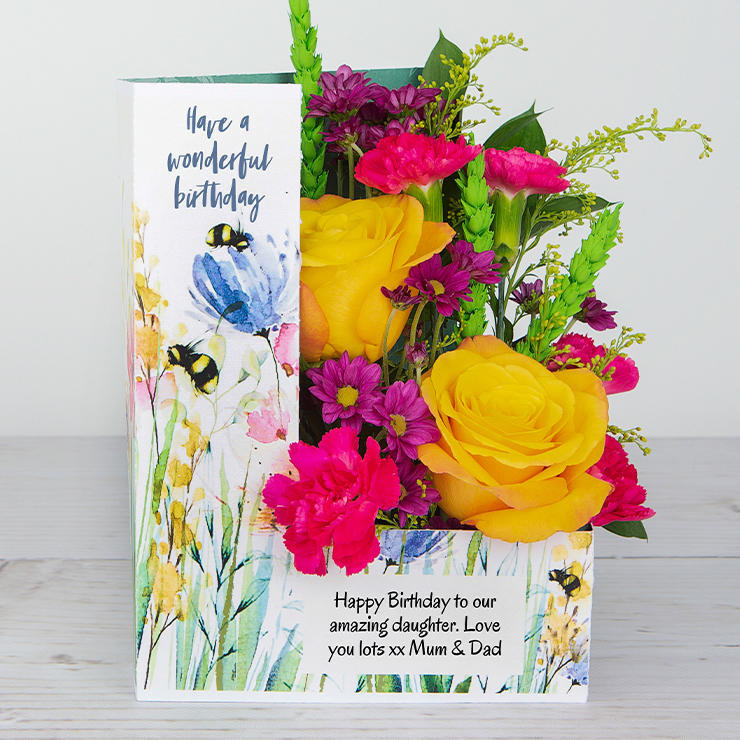
Polychromatic colour harmony in floristry
All the colours of the rainbow
A polychromatic colour harmony uses at least five colours from the colour wheel. The colours may be related by an existing colour harmony, or chosen at random. As florists, this gives us a really fun way to showcase lots of colours. Polychromatic colour harmonies always deliver an upbeat vibe, such as the Birthday Blossom arrangement shown here - perfect for delivering a smile on a birthday, or cheering up a sick friend in hospital.
Hot pink carnations, yellow orange roses, lime green wheat, cerise chrysanthemums, yellow solidago and green ruscus - the polychromatic harmony starts the party!
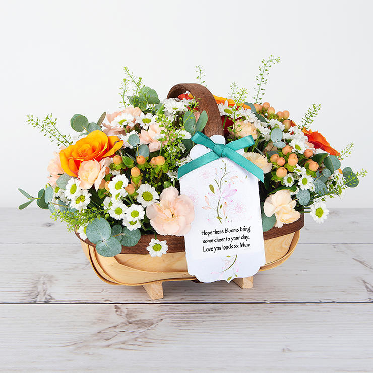
Analogous colour harmony in floristry
Three or four similar colours used together - think red through to orange
An analogous colour harmony is created by combining three or four colours next to each other on the colour wheel. It creates designs that are very easy on the eye.
Our Just Peachy trug arrangement shows how using these closely related colours creates a smooth blend that’s hard to get wrong, whether you use them in fashion, in illustration, or in the home. Analogous colour harmonies are great bets for Mother’s Day and weddings.
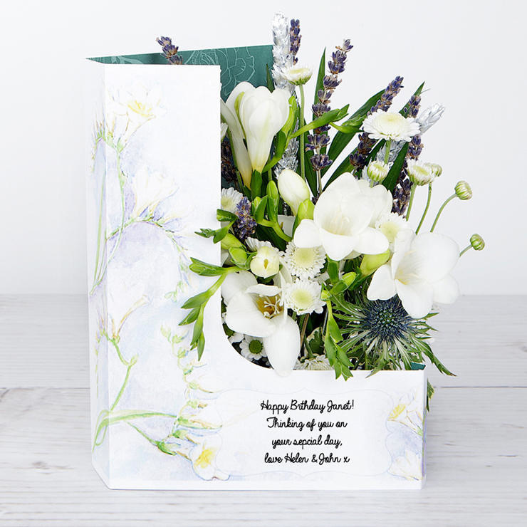
And finally… Achromatic colour harmony in floristry
Black, white and grey doesn’t have to be dark and scary!
An achromatic colour harmony uses only black, white and grey. In floristry, achromatic harmonies are simple and modern, and ideal for designs with a sporting theme. While white flowers are easy to come by, black flowers are not, so it’s an ideal opportunity to spray foliage, or use artificial flowers, to create the desired effect. But as our Freesia Dreams shows, mainly achromatic-based harmonies don’t have to be stark - they can be soft and pretty too.
Enjoyed learning about colour in floral design? For more tips and advice on all things floral, make sure to follow us on Facebook and Instagram.
Recent Posts:
- Retirement Messages: What To Write in a Retirement Card
- A Simple Guide To Wedding Anniversary Names and Ideas on What Gifts to Send to Celebrate Milestones
- Do You Know The Right Flowers To Give At Each Anniversary?
- What is my Birth Flower? Birth Month Flower Guide
- Birthday Wishes For Friends: What To Write In A Birthday Card For Your Friend


